Roku Redesigned Its Home Screen. Read That Sentence Again.
The biggest interface overhaul in over a decade lands, and the most prominent real estate goes to a permanent ad.
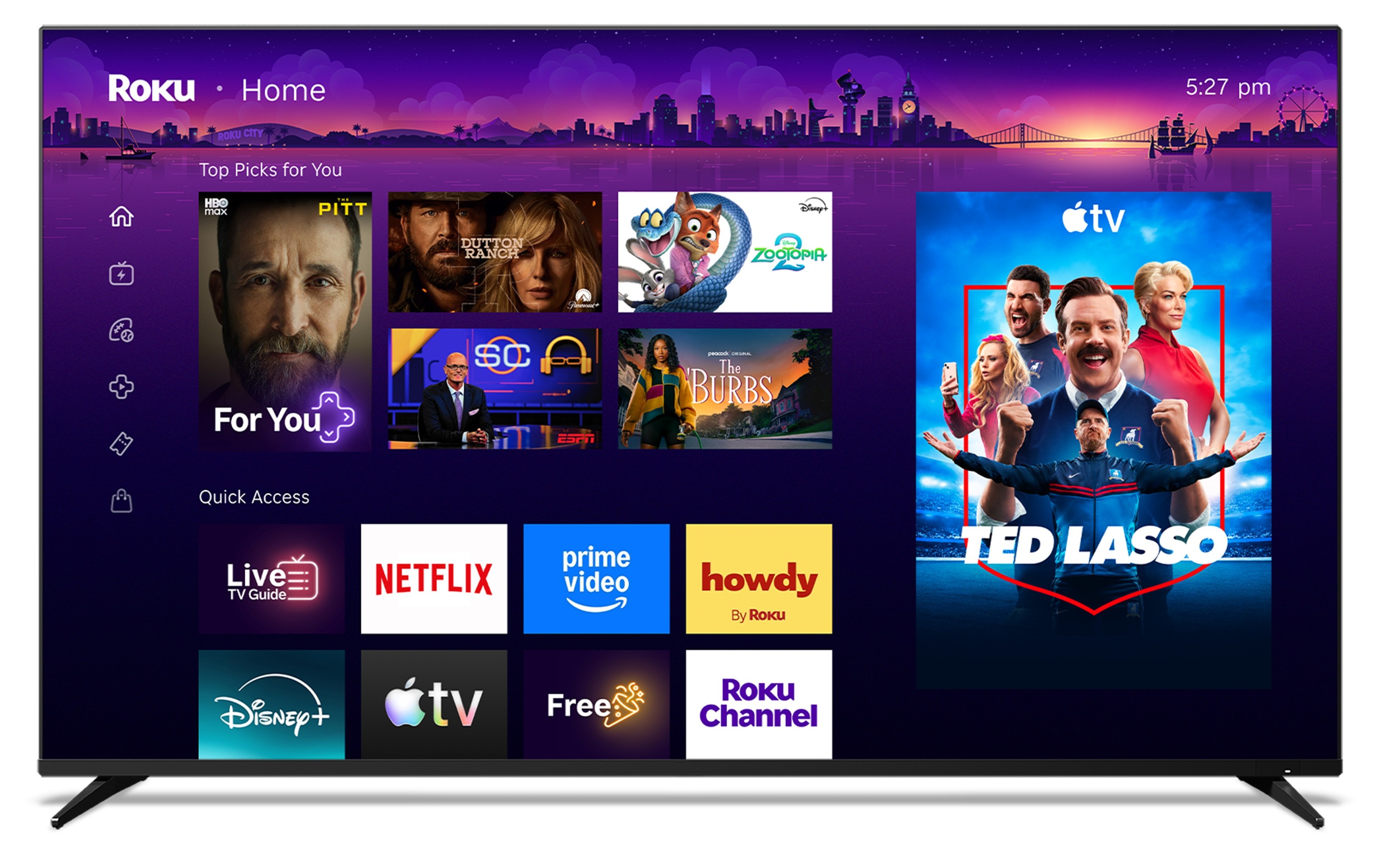
Photo · Ars Technica - All content
There's a version of this story where a decade-plus without a major redesign signals discipline — a company that found something that worked and left it alone. That's not this story.
Roku just rolled out what it's calling its biggest home screen overhaul in more than a decade, and the defining feature, the one that sits at the top of everything you see when you turn on your television, is a large, permanent advertisement. Not a recommendation engine wearing a trench coat. An ad. Permanent. Top of screen. Per Ars Technica's coverage, it's unmistakable enough that at least one person felt compelled to state the obvious out loud: I don't want recommendations. I know what I want to watch.
That quote is doing a lot of work. It's frustration, yes — but it's also a concise autopsy of what these redesigns actually are.
The Interface Is Now the Product
There's a full suite of new features here. MacRumors notes an AI-powered section that surfaces your most-used apps, a "Top Picks for You" row driven by watch history and trending content, and something called "Destinations" — curated hubs organized by genre and mood. Tom's Guide walked through the visual overhaul. The changes arrive automatically, no update required, rolling out to Roku TVs and streaming devices across the U.S. first.
On paper, that's a reasonable list. Smarter app access. Genre hubs. Personalized rows. Fine.
But when the largest, most prominent element on a redesigned home screen is a permanent ad — not a content recommendation, not a shortcut to something you were watching — the rest of the feature list becomes window dressing. You don't spend a decade rethinking an interface to lead with user convenience. You spend it figuring out where the money goes.
This isn't cynicism for its own sake. It's just pattern recognition. Every streaming platform eventually reaches the same inflection point: the moment the interface stops being a tool for the viewer and starts being inventory for the advertiser. Roku just crossed that line with a press release and a rollout timeline.
What a Decade Buys You
The irony is that some of what's new is genuinely useful. An AI layer that learns which three apps you actually open — instead of making you scroll a graveyard of things you installed once — is a real quality-of-life improvement. Genre-based hubs make sense for the casual viewer who turns on the TV without a plan. These are not bad ideas.
But they're also not the headline. The headline is that Roku chose to make a permanent ad the most visible element on a screen that millions of people look at every single day. That's not a design decision. That's a revenue strategy with a UI skin on top.
The people who know exactly what they want to watch — and that Ars Technica quote suggests there are more of them than Roku's product team accounted for — now have to navigate past an ad to get there. Every time. That's the trade Roku made. And it made it quietly, automatically, no software update required.
The best interfaces get out of the way. Roku just put something permanently in the way and called it a redesign.
Keep reading tech.

Hide My Email Has Been Showing Your Email
Apple's privacy flagship has a hole in it. They've known for over a year.

Sony Killed the Disc. Sony Is Also Killing the Store.
Two announcements, one company, and a quiet admission that "ownership" was always their word to define.

Apple Went to the Highest Court It Could Find. That Tells You Everything.
When a contempt ruling sends you to the Supreme Court, you're not defending a policy anymore — you're defending a worldview.
From the other desks.

800 Horsepower, One Ton of Doubt
Lamborghini built the most powerful SUV it's ever made. It's also slower than what it replaced.
Gold Leaf on a Lacquer Dial, and the Weight of What That Costs
Awake's Frosted Leaf Royal Blue asks a question Vietnamese craft has never quite had to answer at this price.
ESPN Named Him. Then Unnamed Him. Nobody's Explaining the Gap.
A retraction without a reckoning is just a deleted link.