The Color Is the Argument
Czapek's titanium Antarctique arrives in Cosmic Blue — and the dial does more work than you'd expect.
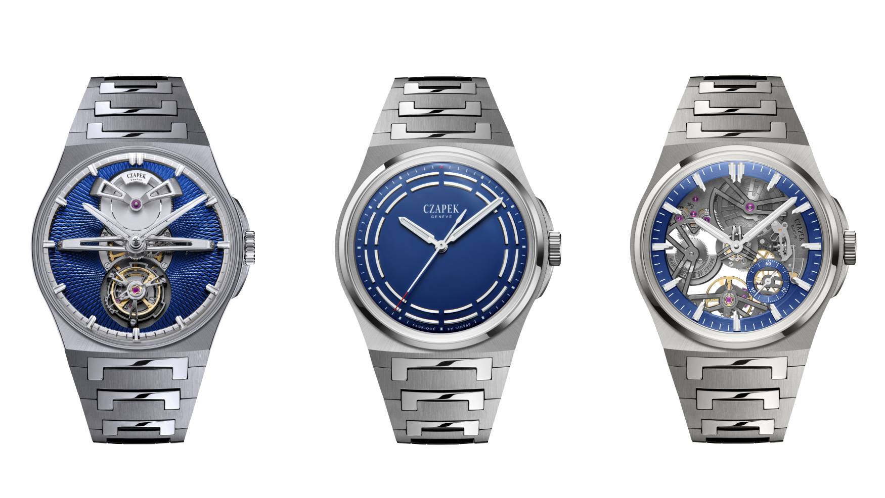
Photo · Time+Tide Watches
There's a version of this story where a brand paints something blue, calls it cosmic, and waits for the press to do the rest. We've seen that story. We know how it ends.
This one feels different — not because the color is extraordinary on its own, but because of what's carrying it.
Titanium Does the Quiet Work
For Watches & Wonders 2026, Czapek & Cie arrived with three new Antarctique references: the Dark Sector, the Révélation, and the Tourbillon. All of them in grade 5 titanium — cases and bracelets both. The Dark Sector and Révélation come in 40.5mm and 38.5mm; the Tourbillon holds at 40.5mm. Every dial wears the same Cosmic Blue.
Titanium is one of those materials that sounds like a spec sheet item until you actually put something made from it on your wrist. Then it becomes a feeling. Feather-light in a way that makes you double-check the clasp. That quality is what Czapek is leading with here, and it's the right instinct — because when a watch disappears on your wrist in the best possible way, you stop thinking about weight and start thinking about everything else the object is doing.
What it's doing, in this case, is presenting a dial color that sits somewhere between the deep end of a swimming pool and the sky just after the last light goes. Scottish Watches called it going "cosmic" — and that word, for once, earns its keep. Cosmic Blue is not navy. It's not the standard sunburst that gets deployed whenever a brand wants to signal restraint. It has depth without drama, which is the hardest register to hit.
Familiar Territory, Differently Inhabited
Deployant noted that Czapek returns here to familiar territory — the Antarctique has been a signature since its launch — but does so with enough to justify the revisit. That's a careful way of saying: this is not reinvention, but it isn't laziness either.
That distinction matters. There's a kind of brand discipline in knowing which of your references can absorb new material treatments without losing their character. The Antarctique, with its particular case geometry and dial architecture, can apparently absorb quite a bit. The titanium doesn't fight the design. The blue doesn't overwhelm it. The three references feel like a coherent family rather than a lineup assembled by committee.
Time+Tide covered the trio with attention to the full-titanium construction — case and bracelet integrated — which is worth sitting with. A bracelet in the same material as the case, matched in color and finish, is one of those decisions that reads as obvious in retrospect and is quietly difficult to execute. When it works, the watch reads as a single object rather than a head bolted onto a strap. When it doesn't, you notice the seam. Here, from what the coverage suggests, it works.
Czapek's CEO Xavier spoke about the releases on the Scottish Watches podcast — the kind of direct conversation that tells you something about how a brand thinks. Whether a CEO can articulate why a material choice matters beyond the marketing language is usually a reliable signal. The brand's willingness to show up and explain themselves is, at minimum, the right instinct.
The question the coverage collectively circles but doesn't quite answer is whether Cosmic Blue is a color that will age the way the Antarctique itself has — whether it belongs to this watch in the way certain colors come to define certain references, or whether it's a seasonal note that dates the piece to 2026.
I don't know. No one does yet.
What I do know is that the combination of a material that removes weight and a color that adds depth is, at minimum, a coherent idea. And coherent ideas in watchmaking are rarer than they should be.
The best version of a familiar thing isn't a copy — it's proof the original was worth returning to.
Keep reading fashion.
Gold Leaf on a Lacquer Dial, and the Weight of What That Costs
Awake's Frosted Leaf Royal Blue asks a question Vietnamese craft has never quite had to answer at this price.

Kyle Smith Has a Job Title That Didn't Exist Before. That's the Whole Tell.
When the NFL hires a fashion editor, it's not about clothes — it's about who gets to decide what matters.
525 Victories, One Dial, and Cycling's Long Wait for a Wrist
Breitling's Eddy Merckx edition doesn't just reference a legend — it asks whether motorsport's younger sibling has finally earned its place in serious watch culture.
From the other desks.
800 Horsepower, One Ton of Doubt
Lamborghini built the most powerful SUV it's ever made. It's also slower than what it replaced.
ESPN Named Him. Then Unnamed Him. Nobody's Explaining the Gap.
A retraction without a reckoning is just a deleted link.

Hide My Email Has Been Showing Your Email
Apple's privacy flagship has a hole in it. They've known for over a year.