The Dial That Disappears Into You
Skin-tone stone dials are the quiet flex that makes every other watch look like it's auditioning for something.

Photo · aBlogtoWatch
A skin-tone stone dial doesn't demand attention — it just makes everyone else's watch look like it's trying too hard.
That's a harder trick than it sounds. Most watchmakers, when they want to make something feel personal, add something. An engraving. A monogram. A limited-edition colorway that 2,000 other people also bought. The result is a watch that announces itself before you've said a word. The skin-tone stone approach does the opposite. It subtracts. It makes the watch feel continuous with the person wearing it, like an extension of the hand rather than an object on top of it.
Sartory-Billard figured this out while the big houses were busy arguing about who could put a meteorite dial on a sports watch first.
The Material Does the Work
Stone dials aren't new. Lapis, malachite, onyx — the industry has been slicing minerals thin and mounting them in cases for decades. But those stones announce themselves. The color is the point. The drama is the point. A deep green malachite dial is a statement piece, and it knows it.
Skin-tone stone is different. The palette runs from pale sand to warm terracotta to something close to deep mahogany — tones that read differently depending on who's wearing the watch. On one wrist it disappears. On another it creates just enough contrast to catch the light at the right angle. The watch changes without changing. That's not a feature you can put in a spec sheet.
The material also has a texture that no lacquer or enamel can fake. Stone is cold to the touch and warm to the eye. It has depth without shine. It doesn't reflect the room back at you — it absorbs it. That quality matters more than it sounds when you're talking about something you look at dozens of times a day.
What the Big Houses Keep Missing
There's a certain irony in the fact that the brands with the most resources to experiment are the ones playing it safest with dials. The references that move the needle — the ones that actually make people stop mid-conversation to ask what someone is wearing — tend to come from smaller houses working with less margin for error.
Sartory-Billard doesn't have the safety net of a century-old name. Every choice has to be right. That pressure produces clarity. When they land on something like a skin-tone stone dial, it's not because a committee approved a trend report. It's because someone understood that the most sophisticated thing a watch can do is feel inevitable on the wrist it was built for.
The watch press will spend the next twelve months writing about ceramic bezels and in-house movements. Both are worth writing about. But the dial question — what should the face of a watch actually look like, and who is it actually for — that one doesn't get enough space.
A watch that feels like it was made for your wrist specifically isn't a niche product. It's the whole point.
Keep reading fashion.
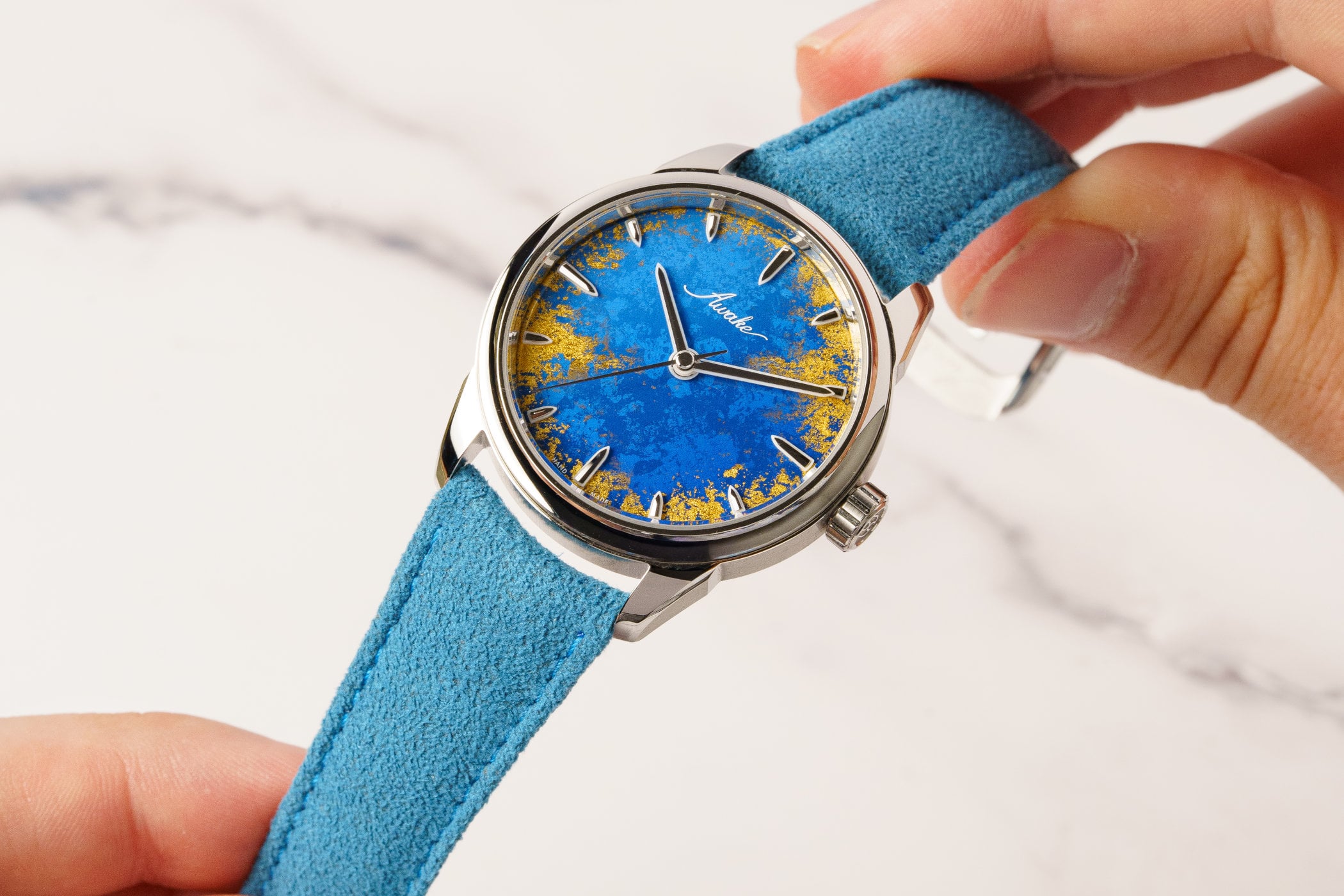
Gold Leaf on a Lacquer Dial, and the Weight of What That Costs
Awake's Frosted Leaf Royal Blue asks a question Vietnamese craft has never quite had to answer at this price.

Kyle Smith Has a Job Title That Didn't Exist Before. That's the Whole Tell.
When the NFL hires a fashion editor, it's not about clothes — it's about who gets to decide what matters.
525 Victories, One Dial, and Cycling's Long Wait for a Wrist
Breitling's Eddy Merckx edition doesn't just reference a legend — it asks whether motorsport's younger sibling has finally earned its place in serious watch culture.
From the other desks.
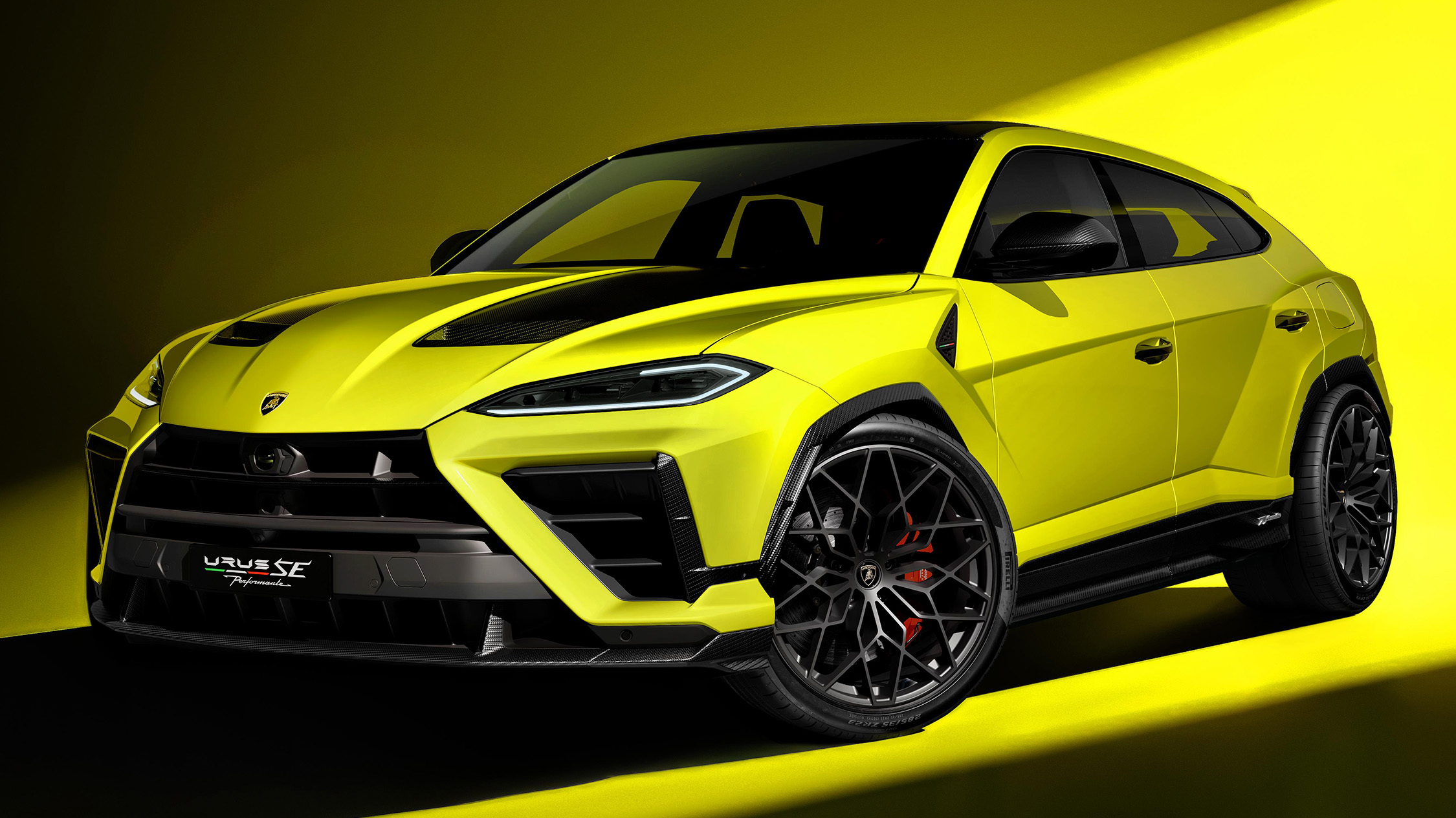
800 Horsepower, One Ton of Doubt
Lamborghini built the most powerful SUV it's ever made. It's also slower than what it replaced.

ESPN Named Him. Then Unnamed Him. Nobody's Explaining the Gap.
A retraction without a reckoning is just a deleted link.

Hide My Email Has Been Showing Your Email
Apple's privacy flagship has a hole in it. They've known for over a year.