Netflix Didn't Build a Feature. It Raised a White Flag.
The vertical video redesign isn't an innovation — it's a confession.

Photo · The Verge
There's a specific kind of corporate announcement that arrives dressed as ambition but smells like damage control. Netflix's forthcoming mobile redesign is that announcement.
The company confirmed in its Q1 2026 earnings letter to shareholders that a redesigned iPhone and Android app — featuring a vertical video feed — is rolling out at the end of April. Co-CEO Greg Peters had telegraphed the move back in January, framing it as a way to better serve what the company is becoming. The official line, quoted directly in the earnings letter, is that the redesign will "better reflect our expanding entertainment offering." Which is one way to put it. Another way: TikTok won, and Netflix would like some of that, please.
The Grammar Has Already Been Written
Here's what's actually being admitted. Netflix noted in that same letter that the lines between TV and mobile entertainment are "blurring" — and that video podcasts, notably, over-index on mobile. That's not a product insight. That's a concession that the phone screen has developed its own culture, its own rhythms, its own native format, and Netflix wasn't the one who built any of it.
Vertical video is TikTok's grammar. Reels borrowed it. YouTube Shorts borrowed it. Now Netflix is borrowing it. The scroll-and-pause interaction, the portrait-mode frame, the feed logic — none of this originated on a streaming platform. It originated on apps that were built around the assumption that attention is scarce and you have to earn the next second. Netflix spent years assuming the opposite: that you showed up, you committed, you watched. That assumption is now being quietly revised.
Android Authority framed it plainly — this update is "unlikely to help your scrolling habit." Which is a dry way of saying that the feature designed to capture distracted attention may simply become another surface for distracted attention. The irony is almost too clean.
What Streaming Looks Like When It Grows Up
The 9to5Mac angle is worth sitting with: Netflix recently drew criticism for its Apple TV app after introducing a custom video player that landed poorly with users. So the company is now making its boldest UI swing in years on mobile — the platform where the stakes feel lower, where experimentation is more forgivable, where nobody expects the Criterion Collection experience. That's either smart sequencing or telling prioritization, depending on how cynical you're feeling.
But step back from the interface debate and look at what's actually happening to the category. Streaming is importing social mechanics. Not because anyone planned for this, but because the phone demanded it. Video podcasts on Netflix. Vertical feeds. Engagement-first UI design. These are not streaming features. These are social media features wearing a Netflix badge.
The blurring the company mentions in its shareholder letter isn't just about screen size. It's about what video is now — ambient, scrollable, parasocial, always-on. Netflix built its identity on the idea that it was the destination. The place you went to watch something. What a vertical feed suggests, quietly but unmistakably, is that Netflix would also like to be the place you end up while you're trying to decide what to watch. Or while you're doing something else entirely.
That's not a streaming service anymore. That's a feed with better production values.
The scroll war was lost before this feature was ever greenlit — Netflix is just finally updating the map.
Keep reading tech.

Hide My Email Has Been Showing Your Email
Apple's privacy flagship has a hole in it. They've known for over a year.

Sony Killed the Disc. Sony Is Also Killing the Store.
Two announcements, one company, and a quiet admission that "ownership" was always their word to define.

Apple Went to the Highest Court It Could Find. That Tells You Everything.
When a contempt ruling sends you to the Supreme Court, you're not defending a policy anymore — you're defending a worldview.
From the other desks.
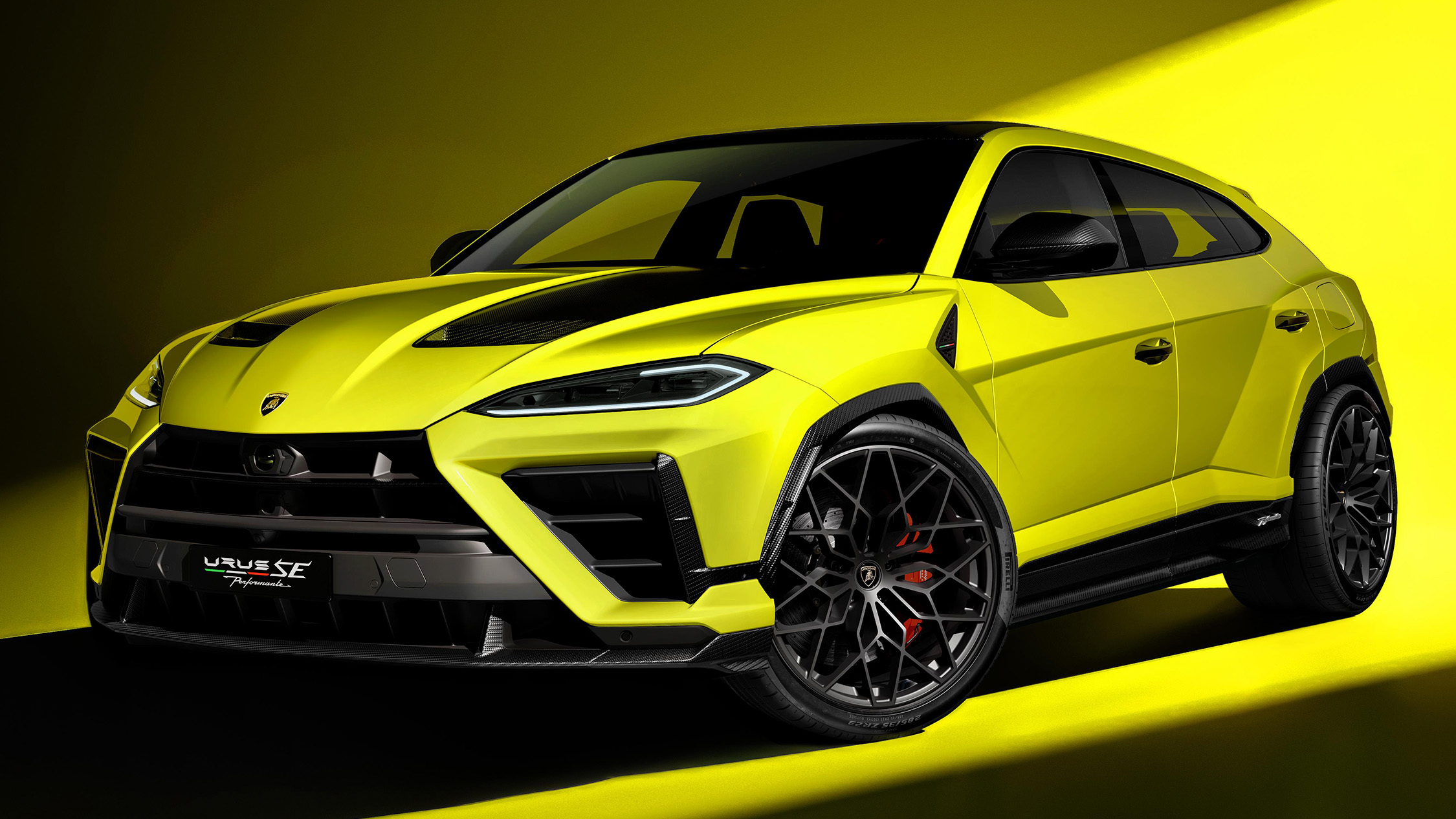
800 Horsepower, One Ton of Doubt
Lamborghini built the most powerful SUV it's ever made. It's also slower than what it replaced.

Gold Leaf on a Lacquer Dial, and the Weight of What That Costs
Awake's Frosted Leaf Royal Blue asks a question Vietnamese craft has never quite had to answer at this price.
ESPN Named Him. Then Unnamed Him. Nobody's Explaining the Gap.
A retraction without a reckoning is just a deleted link.