Hyundai Built a Tesla Screen and Then Put Buttons on It
Pleos Connect borrows the aesthetic and buries the ideology — which tells you everything about where the industry actually landed.
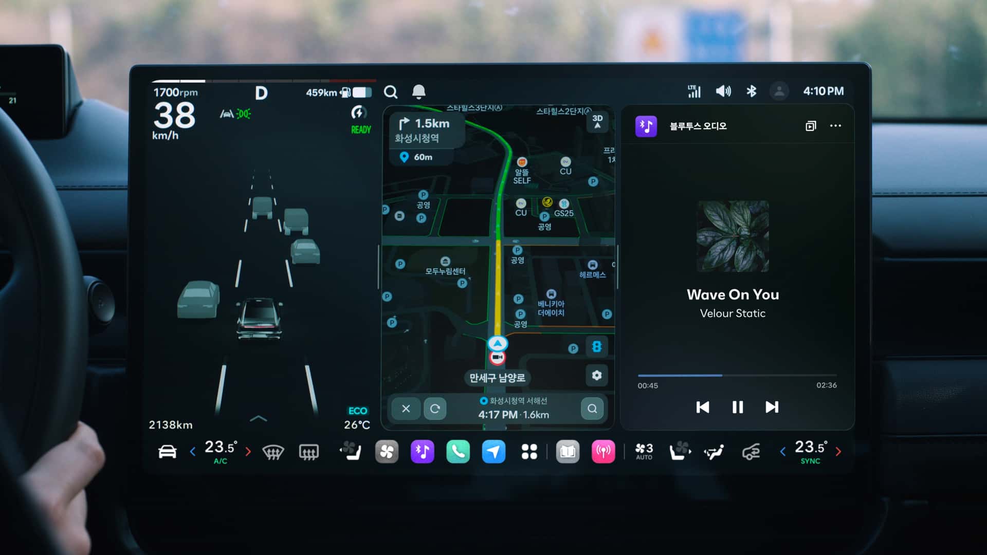
Photo · InsideEVs - Articles
There's a moment in every design trend where someone builds the thing that proves the trend was wrong. Hyundai just did it, and they had the nerve to make it look like a compliment.
Pleos Connect — debuting next month, according to InsideEVs — arrives with the wide dual-screen layout that Tesla made culturally dominant and an AI companion that positions it squarely in the current moment. On first glance, the visual language is familiar: horizontal expanse, clean surfaces, the suggestion that this machine thinks. Carscoops clocked it immediately, noting the resemblance to Tesla's interface in the same breath they pointed out what was different. Electrek went further, framing the entire system around that one key distinction.
The distinction is buttons. Physical ones. Kept, not added back — kept, as in Hyundai looked at the full-screen-or-nothing doctrine and decided, quietly and without drama, not to follow it all the way.
The Confession Nobody's Making Out Loud
What's interesting is how every piece of coverage treats this as a feature rather than a correction. And maybe that's the right instinct — nobody wants to write the obituary for minimalism while minimalism is still selling cars. But read across all three sources and a cleaner story emerges: the industry spent years stripping out tactile controls in pursuit of an aesthetic borrowed from consumer electronics, and now one of its larger players is shipping a system that deliberately reintroduces what was removed, dressed up in the same visual costume.
That's not refinement. That's a verdict.
The touchscreen-only cabin always had a physics problem. You can train your muscle memory to find a volume knob in the dark at 80 miles an hour. You cannot train your eyes to stay off a screen while you hunt through nested menus for the heated seat toggle. Drivers knew this. Reviewers knew this. Safety researchers knew this. The market, apparently, is now knowing it too — because Hyundai didn't make Pleos Connect with buttons because buttons are fashionable. They made it with buttons because someone looked at the data and made a call.
What Pleos Actually Is
Strip the narrative and you have a system that combines the large-format dual-screen layout with AI integration, app connectivity, and enough physical controls to handle the things you shouldn't be looking at a screen to do. InsideEVs flagged the AI companion as a centerpiece — the kind of feature that leads press releases and, in a year, gets treated like a given. The screens give it presence. The buttons give it honesty.
The Tesla comparison will follow Pleos everywhere, and that's probably fine. Tesla normalized the wide-screen interior and made it aspirational. What Hyundai has done is take that aspiration and run it through the filter of actual usability — which means the comparison eventually inverts. You stop asking whether Pleos looks like a Tesla and start asking whether Tesla's approach still looks right.
One answer is already sitting in the cabin: a row of buttons that shouldn't need defending, and yet somehow feel like a statement.
The automaker that admits touchscreens have limits before everyone else does doesn't lose the aesthetic argument — they win the one that matters more.
Keep reading cars.
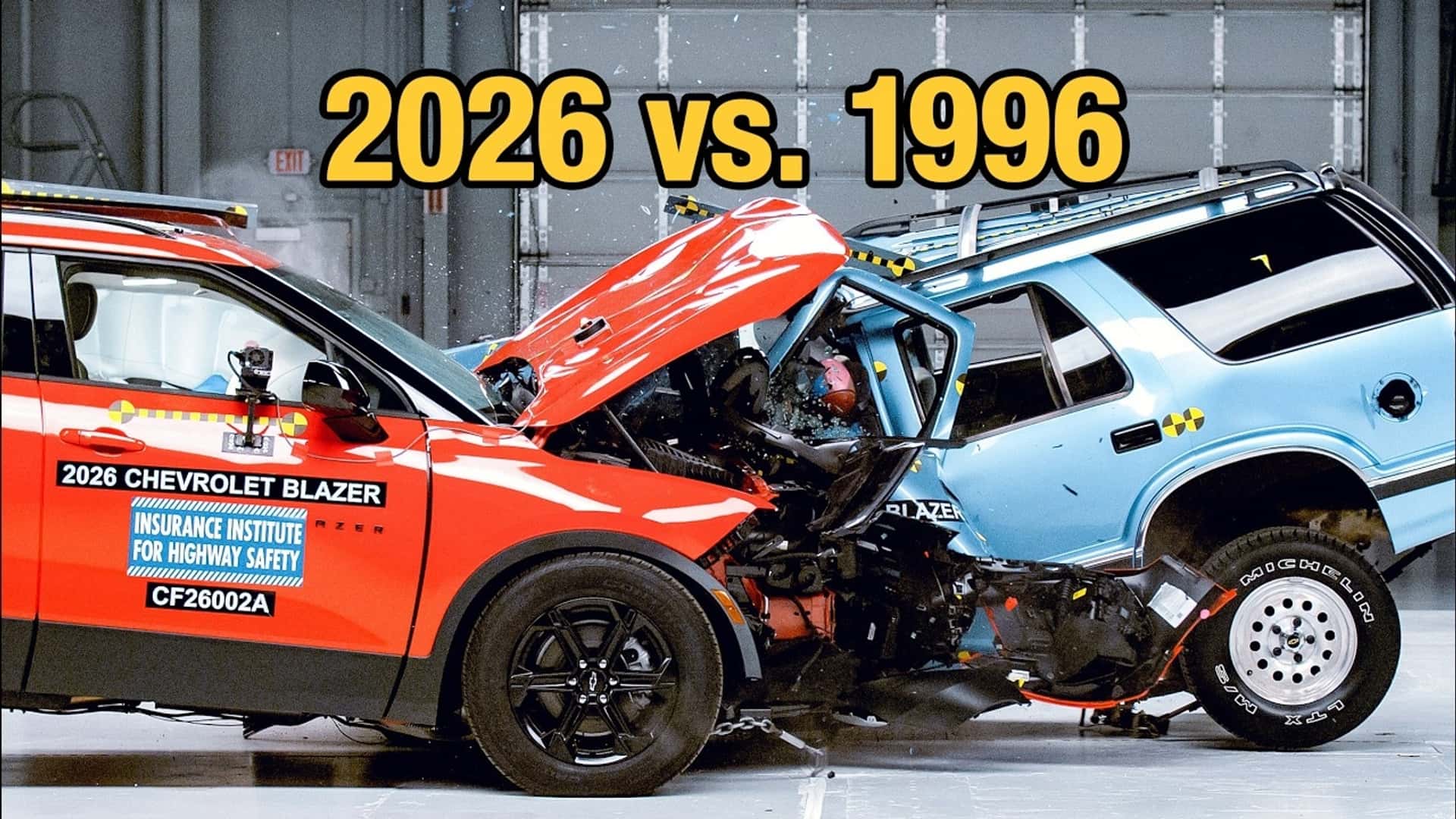
Thirty Years of Progress, Captured in About Four Seconds of Footage
The IIHS put a 2026 Chevy Blazer into a 1996 model and the result isn't satisfying — it's haunting.
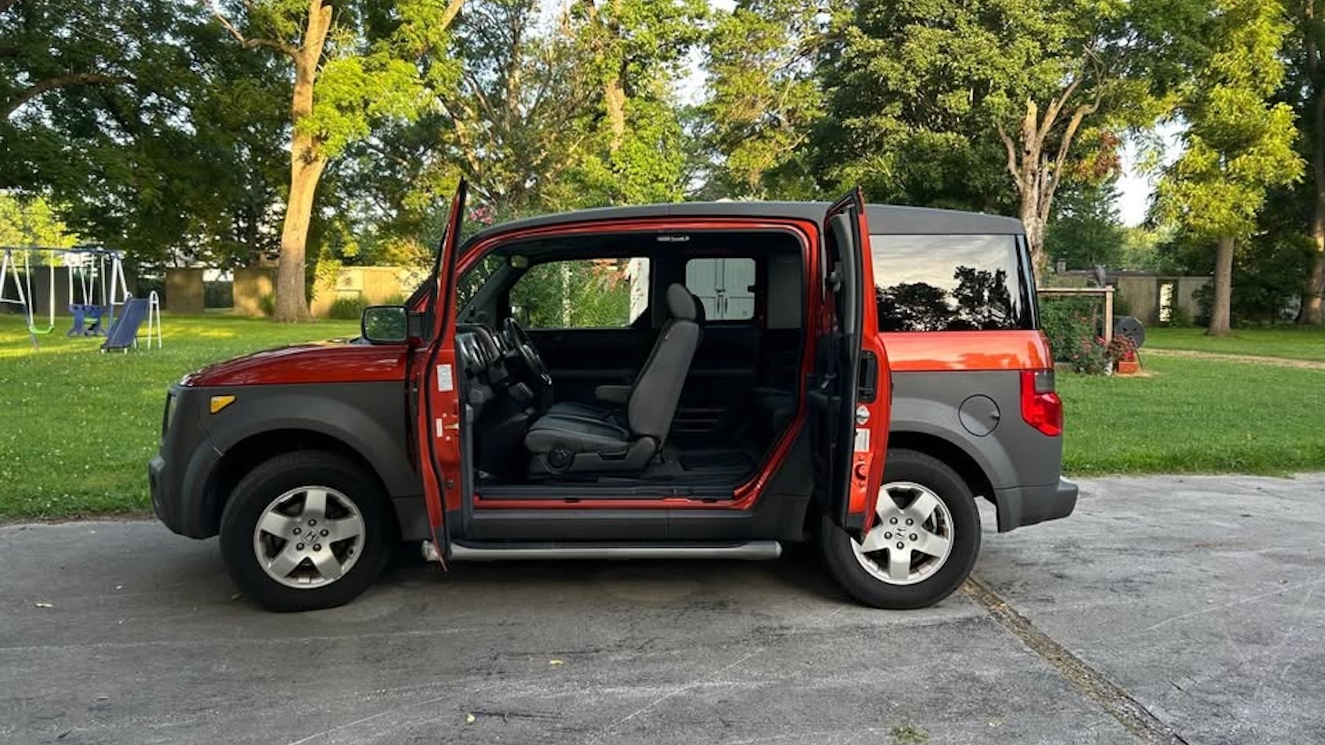
Honda Remembered What the Element Was For
A boxy cult car returns in 2029 with a hybrid powertrain and an eye on the Bronco Sport — which tells you everything about who Honda thinks it lost.
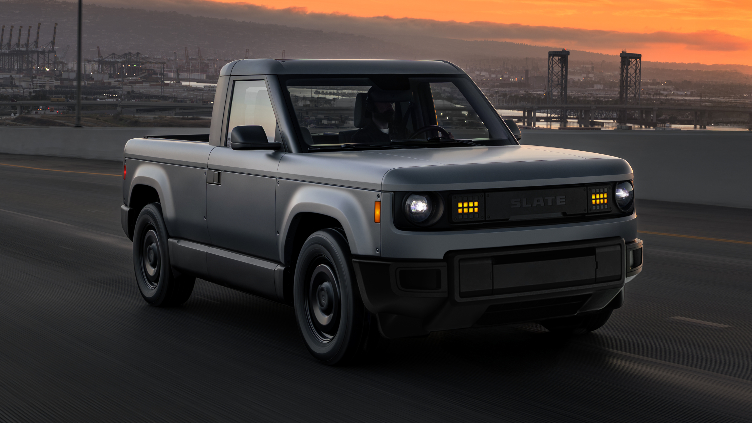
Slate Priced It at $24,950 and Dared America to Say It Wants More
Every other EV maker promised affordability. Slate shipped a number.
From the other desks.
Paris Keeps Building Bigger Waves. The Water Came From Somewhere Else.
SS27 had spectacle, subversion, and a tennis tournament — but the most interesting clothes weren't on any runway.

College Basketball Cashed Out. The Draft Just Ran the Receipt.
When the first 20 picks all played college ball, NIL stops being a controversy and starts being the pipeline.

Microsoft Said 'Breakthrough.' A Physicist Said 'Check Your Python.'
When a flagship quantum chip gets peer-reviewed into a corner, the real question isn't about qubits — it's about who we let define progress.