Carbon Fiber, Racing Colors, and the Watch Tudor Didn't Need to Justify
The Black Bay Chrono Carbon 26 isn't selling you on movement architecture. It's selling you a pit wall.

Photo · Worn & Wound
There's a moment in every watch launch where you look past the technical sheet and ask what the thing is actually about. Tudor's new Black Bay Chrono Carbon 26 answers that question before you finish asking it.
The colors do the talking.
The Livery Is the Brief
According to WristReview, the watch — reference M79377KN-0003 — takes its palette directly from the livery of Visa Cash App Racing Bulls, the Formula One constructor Tudor is partnered with. The team, which has raced under a few names over the years (Racing Bulls, AlphaTauri, Toro Rosso before that), fields two cars on the current F1 grid. Their visual identity is specific, recognizable, and — crucially for Tudor — the entire design rationale of this release.
That's not a criticism. It's an observation about what kind of object this is.
Worn & Wound notes the watch arrives as the 2026 Formula One season gets underway, and the timing is not accidental. Watches & Wonders has come and gone. This is a different kind of launch — timed to the race calendar, not the trade fair circuit. Tudor is treating its F1 partnership less like a sponsorship banner and more like a product development schedule.
Which raises the more interesting question: when a racing livery becomes the brief, what exactly is being designed?
What the Carbon Tells You
The case material and the colorway both point in the same direction. Carbon is a motorsport material — functional in context, symbolic everywhere else. Wearing it on your wrist doesn't make you faster. It signals a set of references: speed, engineering discipline, things built to perform rather than to impress at dinner. Whether that signal lands depends entirely on whether you care about where it comes from.
For people who follow the Racing Bulls cars around the 2026 calendar, this watch will read as a direct extension of something they're already invested in. For everyone else, it's a well-constructed chronograph in striking colors with a material choice that justifies itself on aesthetics alone.
Both readings are fine. Tudor seems to understand that.
What strikes me is how cleanly this sidesteps the usual watch launch conversation — the one about movement architecture, finishing depth, the case dimensions relative to some predecessor from 1958. None of that is irrelevant, but none of it is the story here either. The story is that a brand has found a visual identity compelling enough to build a watch around, and that the watch is honest about what it is. It's not pretending to be a heritage piece. It's not pretending the colors are incidental.
The racing colors are the product. The craft holds them up.
There's something almost refreshing about a release this clear on its own intentions. The watch knows its audience, knows its moment, and doesn't apologize for either. In a category where every new reference tends to arrive dressed in decades of mythology it may or may not have earned, a watch that simply says this is the car, this is the season, this is the object has a kind of confidence that's harder to pull off than it looks.
Not every watch needs to outlast the partnership that inspired it. Some are meant to mark a specific time — and mean more because of it.
Keep reading fashion.
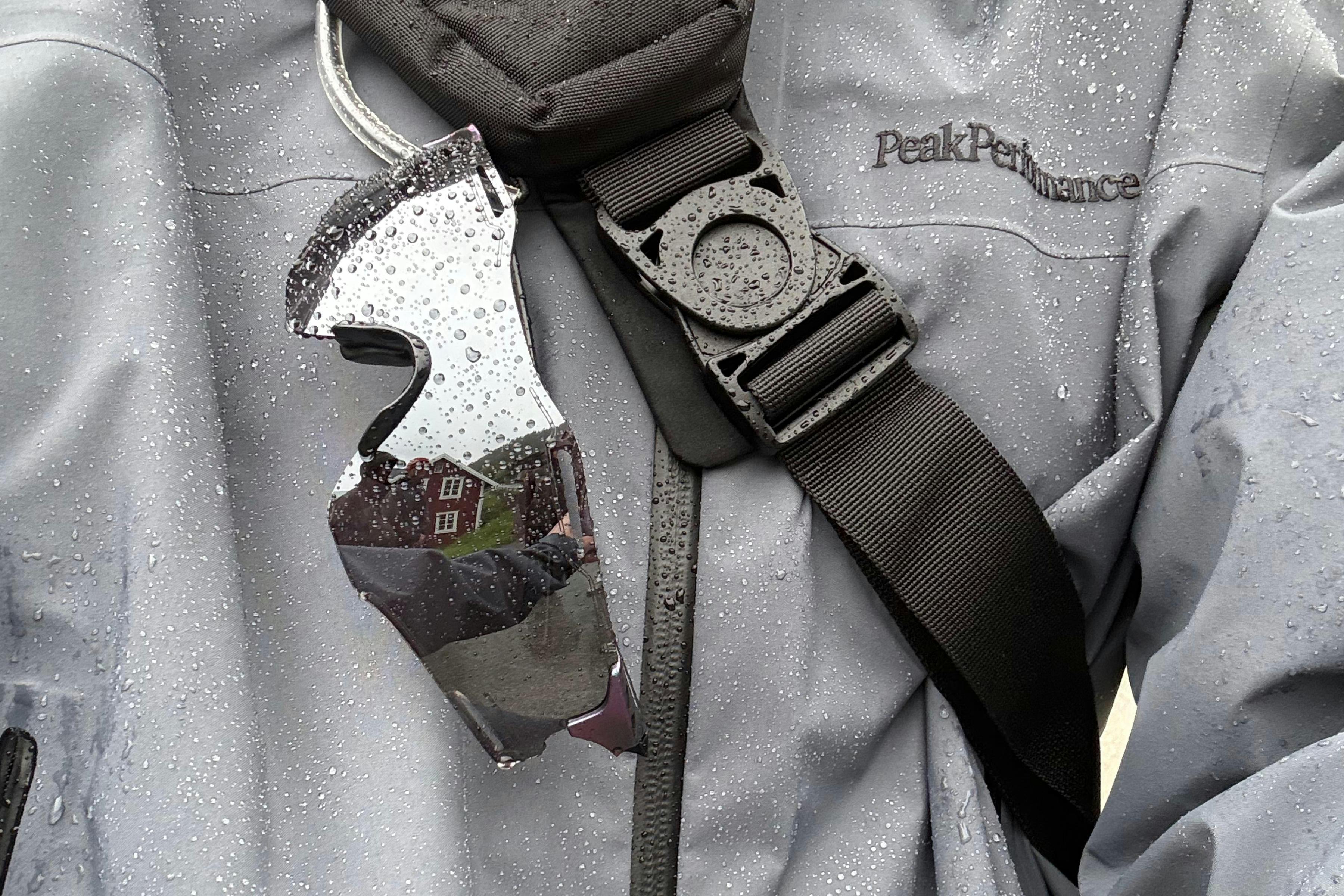
Forty Years, and Peak Performance Went Back to Ask the Mountain
A heritage brand's best argument isn't a campaign. It's the conditions it was built for.

OG Wore It When It Mattered Most. Now You Can Wear It Too.
The SKX Nexus 'NYC Blue' PE is a championship shoe from a brand that just rewrote the pecking order.

Men Wore the Joke and Nobody Laughed It Off
Spring 2027 menswear didn't loosen the suit's collar — it asked whether the collar was ever the problem.
From the other desks.
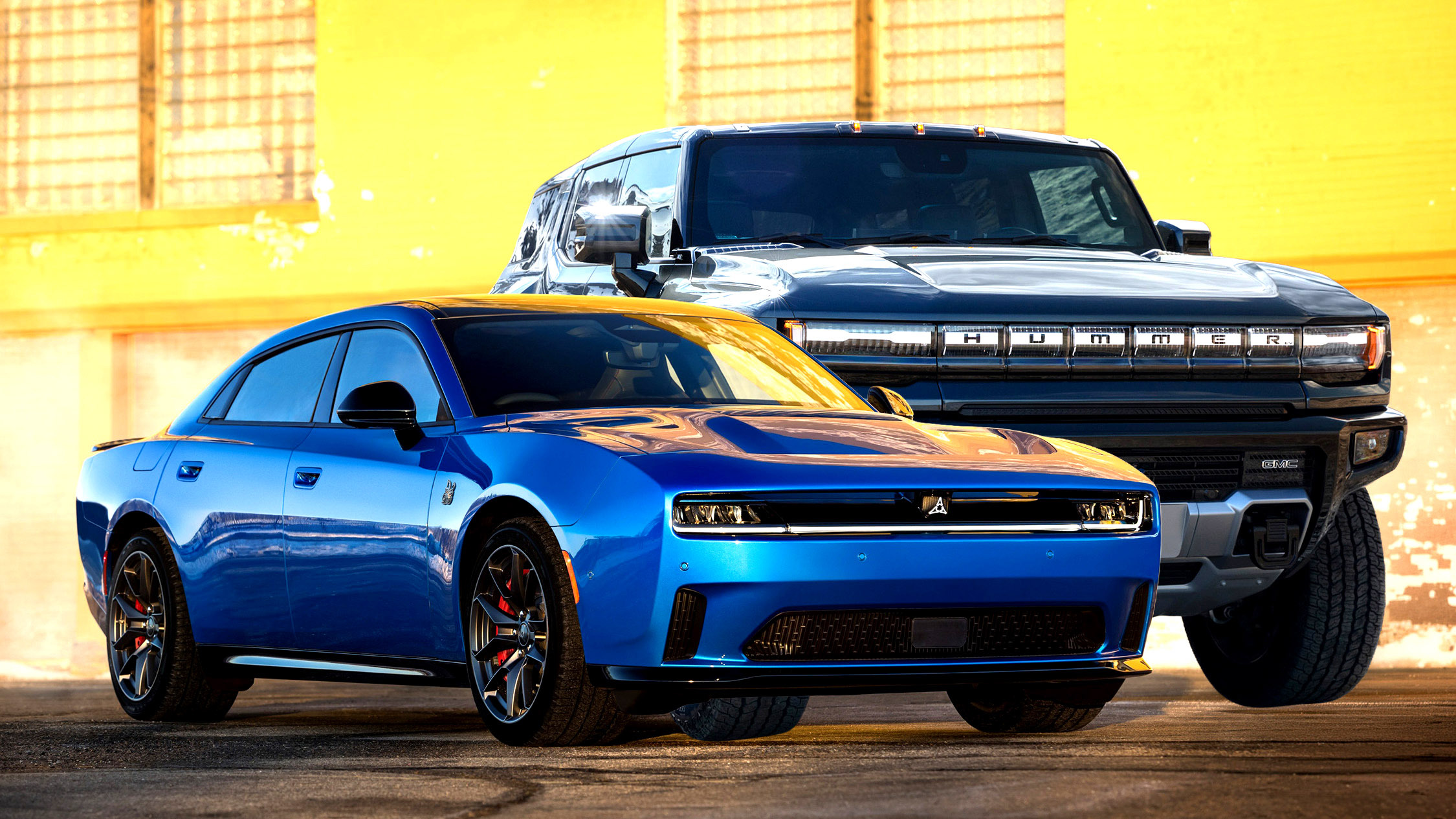
The Truck Costs $100K. The Restraint Cost Nothing. Guess Which One They Skipped.
New insurance data puts the most expensive EVs at the top of the worst-behavior charts — and it says something uncomfortable about what performance ownership has become.

Giannis Is Available. The Cap Isn't.
Boston wants the league's best player. The salary cap wants a word first.

Beijing Moved Its Data Centers Off the Planet
China just announced a satellite AI infrastructure alliance, and the interesting part isn't the ambition — it's the timing.