Your Apps Finally Look Like They Belong
Liquid Glass isn't a visual trend — it's the first time your phone's software has felt as considered as the hardware holding it.
Apple has been quietly building a case that the iPhone's interface should feel as deliberate as its chassis. With Liquid Glass rolling into third-party apps, that case is getting hard to argue with.
The hardware has been beautiful for a long time. Since the iPhone 4, really — that glass-and-steel sandwich was a statement about what a phone could feel like in your hand. The software never quite caught up. It got cleaner, flatter, more refined. But it always felt like something running on top of the device rather than something that belonged to it. A capable tenant in a building it didn't design.
Liquid Glass changes the relationship.
What Actually Changed
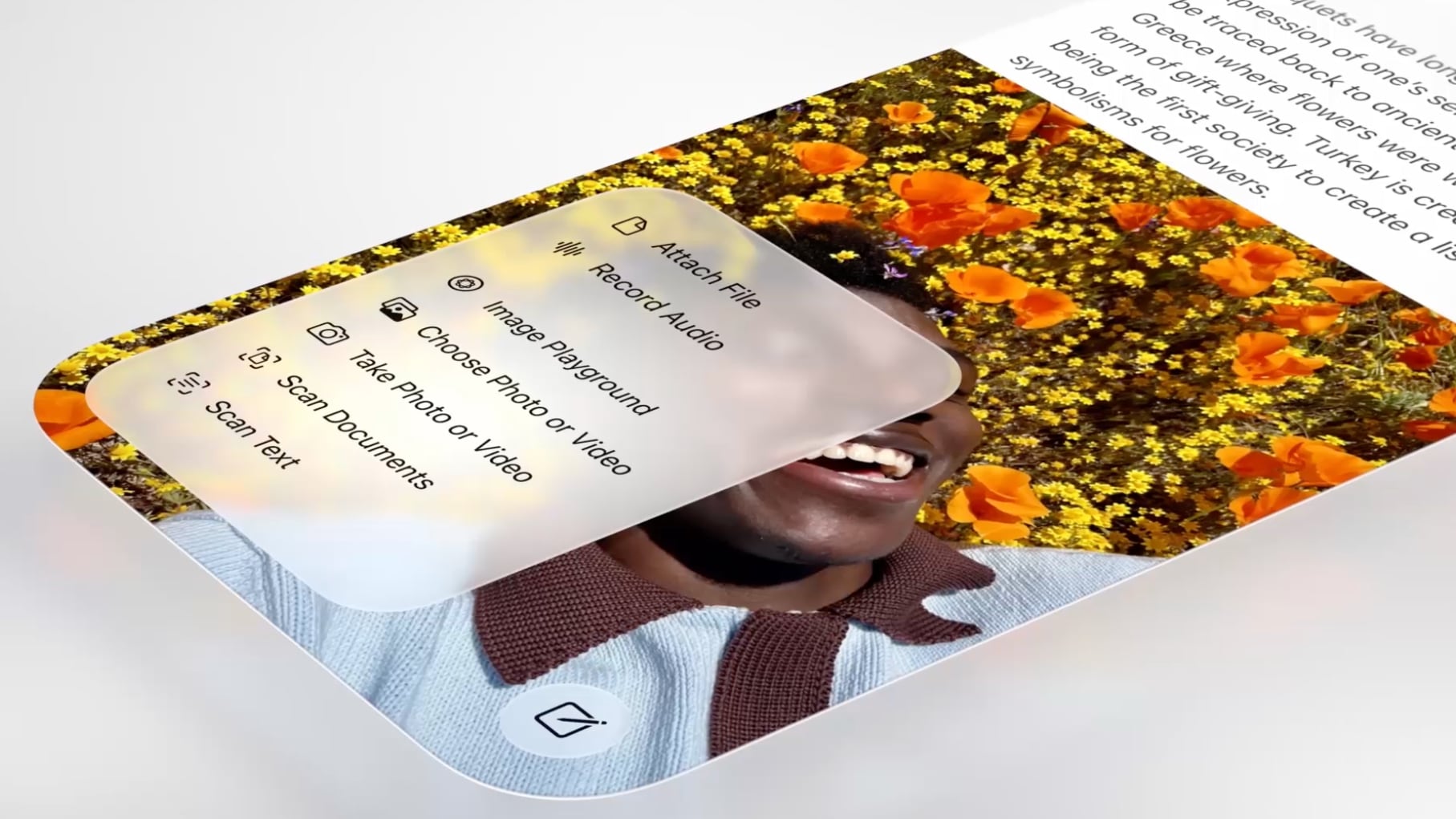
This isn't a new color scheme or a refreshed icon grid. It's a material. Glass that responds to what's behind it. Tab bars and navigation buttons that have actual visual weight — the kind of thing that makes you realize how long you've been staring at elements that felt like placeholders. The updated Design Gallery shows what happens when interface components stop looking like they were designed in a vacuum and start looking like they were designed for this object, specifically.
You notice it for about two seconds. Then you just live inside it. That's the mark of design that's actually working.
Apple has tried to close this gap before. Skeuomorphism was one answer — make everything look like a physical object. Flat design was the overcorrection — strip it all back, let function lead. Both were philosophies. Liquid Glass feels more like a material truth: the screen is glass, the frame is glass, so the interface should behave like glass too. It's not a metaphor. It's just honest.
The Developer Signal
What's worth paying attention to is the timing of the rollout. Showing third-party adoption this early isn't a feature announcement — it's a directive. Apple is telling developers what the new baseline looks like before most users have even seen it. The apps in the gallery aren't there to impress. They're there to set expectations.
That's a different kind of pressure than a style guide. When Apple shows you what coherence looks like in the hands of real developers, it becomes much harder to ship something that doesn't match. The gap between a Liquid Glass app and a legacy-feeling app is going to be immediately visible to anyone who's used both. Users won't have the language for it. They'll just feel it.
The ecosystem will fragment anyway — it always does. Some apps will adopt the language fully. Some will bolt on the aesthetic without understanding the logic behind it. Some will do nothing and hope nobody notices. They will notice.
But the developers who actually sit with the Design Gallery, who understand that this isn't about making things look glossy but about making software feel like it was made for the device it lives on — those developers are about to have a meaningful advantage. Not in features. In feel. And feel is what people describe when they tell a friend to switch.
The ones who get it are going to look very good very soon.
Keep reading tech.
Hide My Email Has Been Showing Your Email
Apple's privacy flagship has a hole in it. They've known for over a year.

Sony Killed the Disc. Sony Is Also Killing the Store.
Two announcements, one company, and a quiet admission that "ownership" was always their word to define.
Apple Went to the Highest Court It Could Find. That Tells You Everything.
When a contempt ruling sends you to the Supreme Court, you're not defending a policy anymore — you're defending a worldview.
From the other desks.

800 Horsepower, One Ton of Doubt
Lamborghini built the most powerful SUV it's ever made. It's also slower than what it replaced.
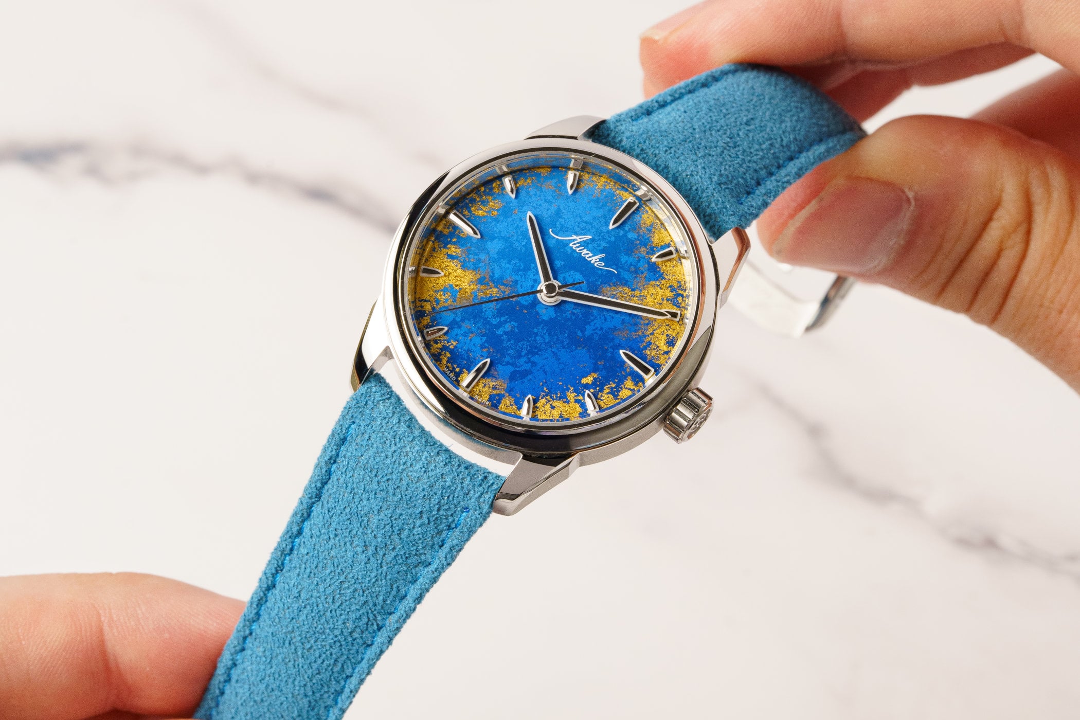
Gold Leaf on a Lacquer Dial, and the Weight of What That Costs
Awake's Frosted Leaf Royal Blue asks a question Vietnamese craft has never quite had to answer at this price.

ESPN Named Him. Then Unnamed Him. Nobody's Explaining the Gap.
A retraction without a reckoning is just a deleted link.