Google Filled the Screen and Stopped Pretending Otherwise
Android Auto's edge-to-edge update isn't a feature — it's a concession that the car screen was always the phone's territory.
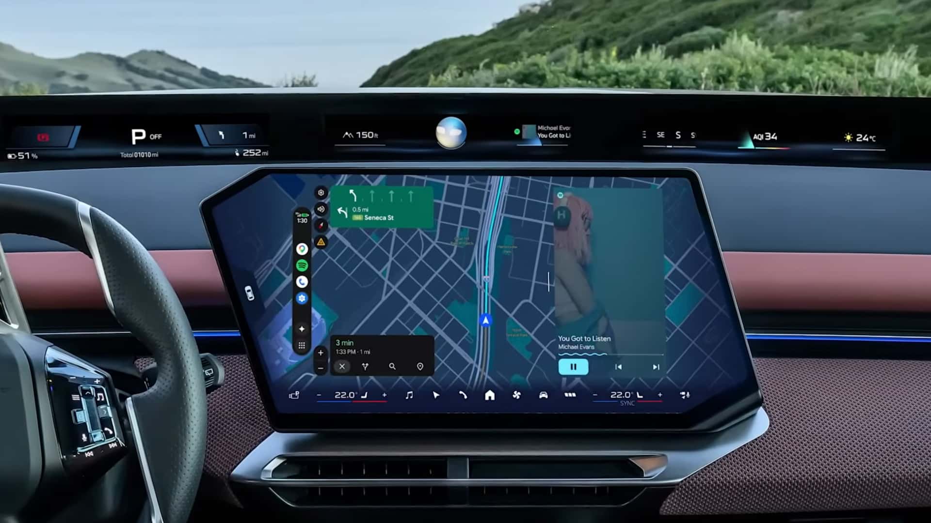
Photo · InsideEVs - Articles
There's a border that's been annoying drivers for years. Black bars. Dead margins. A navigation map squeezed into a rectangle that doesn't match the screen it lives on, surrounded by nothing — just wasted glass, like a painting hung in a frame two sizes too big. Google just got rid of it.
The new Android Auto update brings edge-to-edge maps to every car screen — not just the ones shaped like a standard tablet, but the odd ones too. The Autopian flagged exactly this: connecting Android Auto to something like a new Mini or a recent Cadillac has long meant fighting the geometry, forcing a square interface into a surface that was never square. That fight is over. The interface now fills the canvas, whatever shape the canvas takes.
InsideEVs notes that HD video and uninterrupted playback are also coming with the update. Which means this isn't a cosmetic patch. It's a renegotiation.
The Screen Was Never Really Yours
Automakers spent years designing dashboards around the assumption that they owned the screen. Then they added CarPlay and Android Auto as an afterthought — a concession to users who refused to give up their phone ecosystem the moment they buckled in. The interface sat in a corner, or a zone, or a carefully bounded region that implied: this is borrowed space.
Edge-to-edge ends that fiction. When your phone's navigation fills every inch of the display — when there's no margin left to remind you that the car manufacturer built this screen first — the hierarchy becomes obvious. The car is the hardware. The phone is the operating system. Always was.
That's not a knock on manufacturers. It's just an honest accounting of where driver attention has gone for the past decade. People trust their phone maps. They trust their phone music apps. They trust the interface they've used every day, not the one that resets every time they get a new vehicle. Google didn't invent that preference. It just finally stopped designing around it apologetically.
Screens That Were Always Awkward
The detail that sticks with me is the weird-shaped screens problem. Automakers have spent years differentiating their dashboards with unconventional display geometries — ultra-wide, portrait-oriented, curved, asymmetric. It looked bold in the showroom. Then Android Auto launched inside it and the whole thing looked broken. Margins everywhere. The interface clearly designed for a different room.
The Autopian's framing nails it: square peg, round hole. And for a long time, Google's answer was essentially we'll get to it. Now they have. The update adapts to the screen rather than demanding the screen conform to it.
This matters beyond aesthetics. A cramped or misaligned map is a glance that takes a half-second longer to read. A half-second on a highway is distance. The interface filling the screen properly isn't just cleaner — it's marginally, meaningfully safer.
The car screen is a canvas now. Your phone is the painter. Google just handed it a bigger brush.
Keep reading cars.
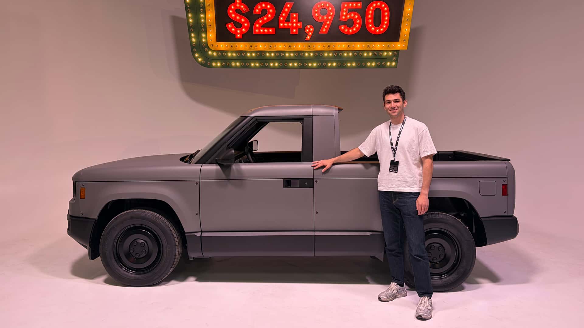
Under $25,000, Crank Windows, No Apology
Slate built a truck that costs less than a decent used F-150, and the coverage can't decide if that's genius or a problem.

406,024 Units and a Question Nobody Wants to Answer Out Loud
Wall Street just told us what Tesla recovery looks like. It's less exciting than the original story.
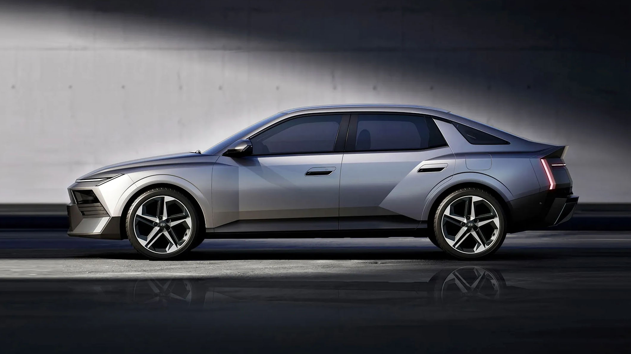
Hyundai Drew Supercar Lines on a Commuter Car. Now Everyone Has to Respond.
The 2027 Elantra didn't borrow from the competition — it borrowed from something much more dangerous.
From the other desks.
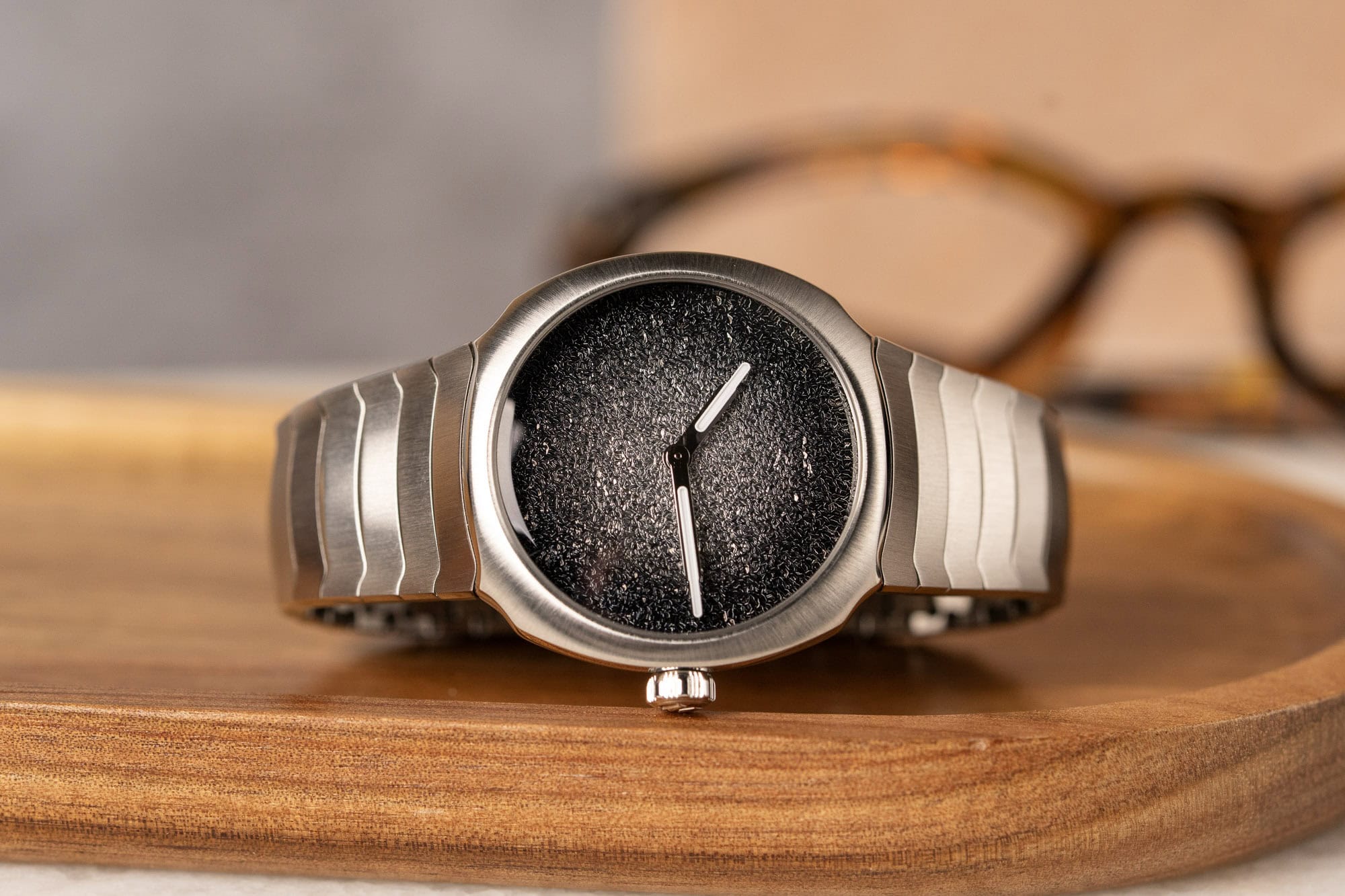
H. Moser Stopped Explaining Itself. Worn & Wound Noticed.
A writer comes back to the Streamliner Minis with enamel dust still on their hands, and the watches hold up.
Doug Martin's Parents Filed Eight Claims. The Ninth Is Unwritten.
A lawsuit over a former NFL player's death in police custody asks whether institutions built to protect themselves can ever admit what happened.
Helpfulness Was Always the Attack Surface
Mozilla's researchers didn't break Claude Code. They let it do exactly what it was built to do.